UI/UX Design • Mobile App
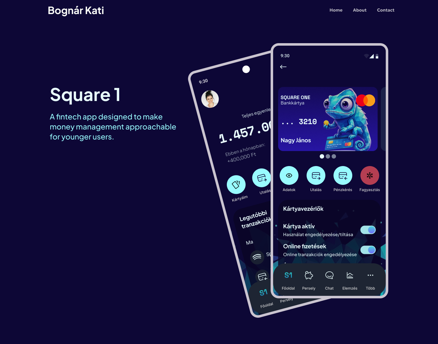
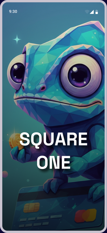
Square One
A fintech app designed to make money management approachable for younger users.
UI/UX Design • Mobile App
A fintech app designed to make money management approachable for younger users.
Overview
Square One is a conceptual fintech app for users aged 16–28, designed to make financial management accessible and engaging.
I conducted in-depth interviews with 3 users (aged 18–28), all active mobile banking users managing finances daily.
Research goals:
Findings were synthesized into an empathy map, surfacing deeper motivations beyond explicit answers — especially around financial confidence and the fear of being judged for not knowing enough.

Research findings were synthesized into a structured design framework across three layers.
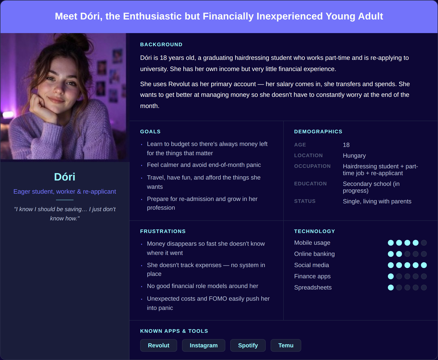
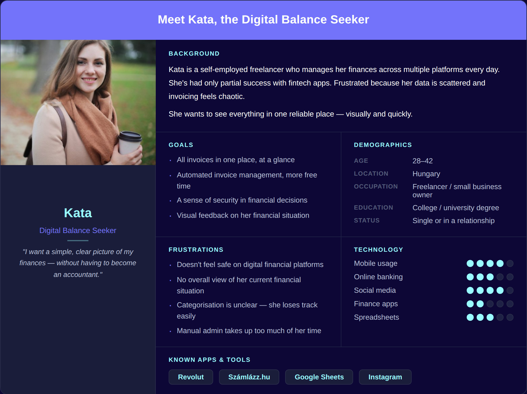
Personas
Two behavioral personas were developed from interview data and the empathy map: a time-poor young professional with financial awareness, and a financially curious but underinformed student. Grounded in observed patterns, not demographic assumptions.
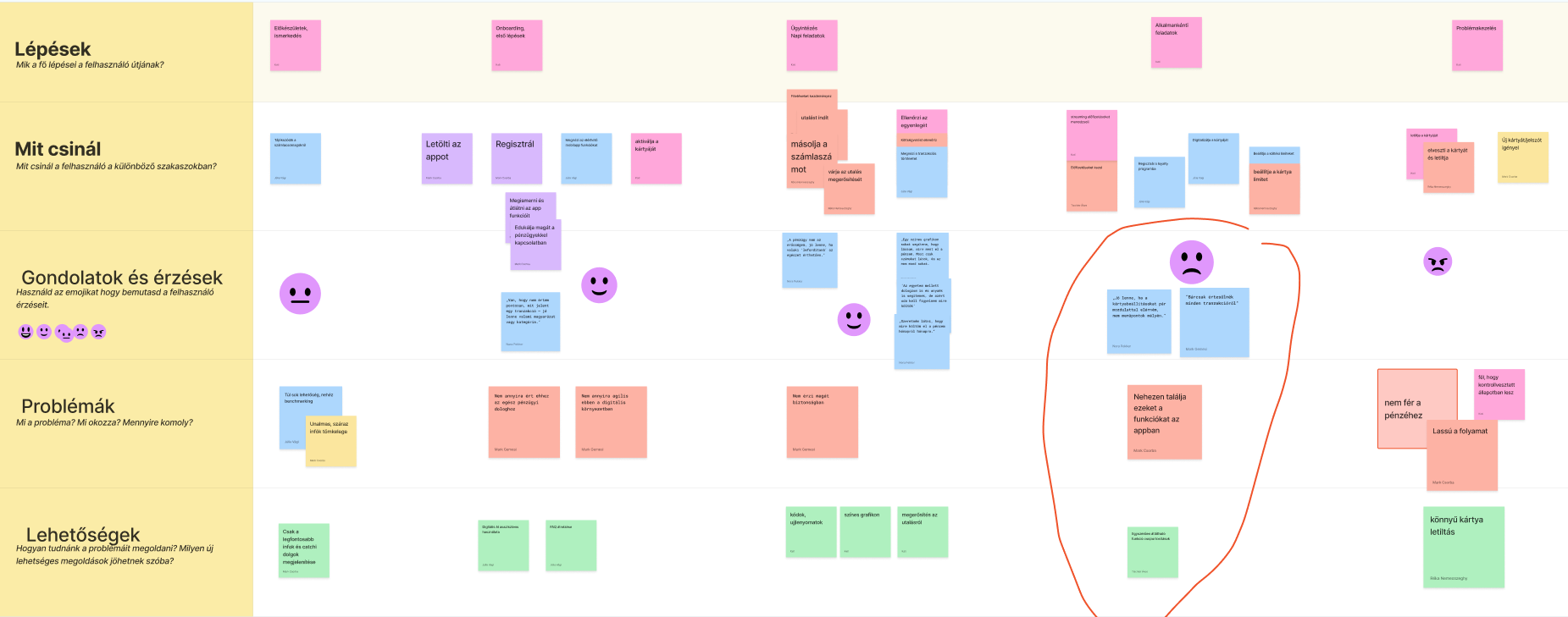
User Journey
Two complementary journey maps grounded decisions in real behavior: an app-use journey across 5 stages (onboarding, daily tasks, communication) mapping actions, thoughts, pain points, and opportunities; and a monthly financial cycle, from payday optimism to end-of-month panic. Together they revealed the core issue — not a broken screen, but a repeating stress pattern the product should help break.
How Might We:
Ideation started with competitive analysis of Revolut, Wise, OTP, and Erste — reviewing UX flows, navigation patterns, and emotional engagement strategies. Mastercard brand guidelines were also integrated.
Key decisions:
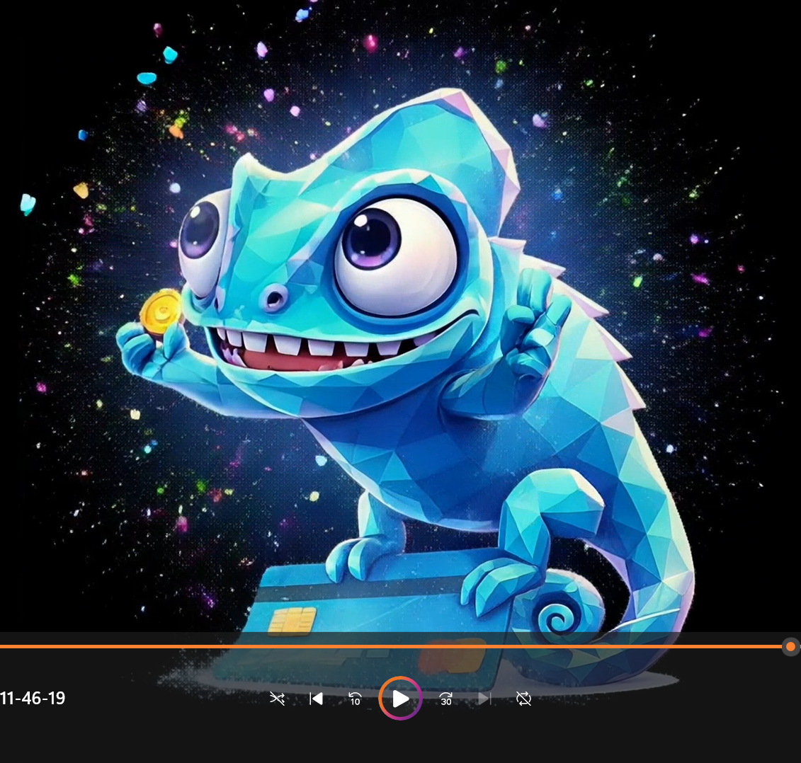
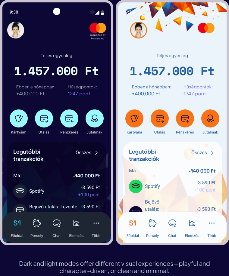
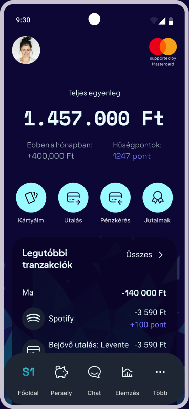
The high-fidelity prototype was built in Figma in both dark and light mode. Dark mode is the primary experience, confirmed as preferred by the target demographic. Design system highlights: teal and purple accents drawn from Kami's visual identity, grey card surfaces against a deep blue background, a clean and spacious typography system, and an animated Kami integrated into loyalty flows and onboarding.
Round 1 — Mentor review (3 mentors): all three supported Kami as a differentiating element; 2 of 3 preferred the togglable version over mandatory presence. Key validation: Kami belongs to the loyalty layer, not the onboarding gate.
Round 2 — Design community feedback: divided on the character, but aligned on one concern — excessive optionality creates complexity. Result: reduced decision points across the interface, with a tighter hierarchy surfacing the most important actions first.
Colours were derived from the character to create a cohesive, emotionally engaging experience. The palette balances playfulness with trust, avoiding overly “corporate” fintech visuals.
Key numbers & headings — strong visual focus and scannability. “Your money, your way.”
Body text — high readability and a clean, accessible feel.
Every screen shows only what the user needs right now.
Charts guide the eye first; numbers are there to confirm.
Every transaction is traceable, nothing hidden.
Key Screens
Onboarding: two onboarding paths support different user preferences — playful guidance or a more traditional experience.
Dark & light: the two modes offer different visual experiences — playful and character-driven, or clean and minimal.
Cards, savings & chat: card management features Kami as a brand element on the card itself; the savings jar makes goal-based saving tangible and motivating; and the chat assistant — powered by Kami — guides users through banking tasks in a friendly, conversational way.